PERE BEER
ABOUT
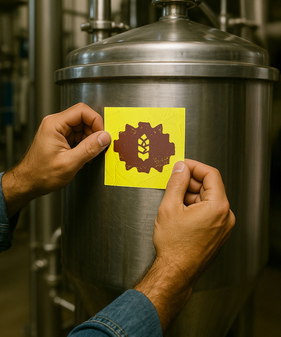
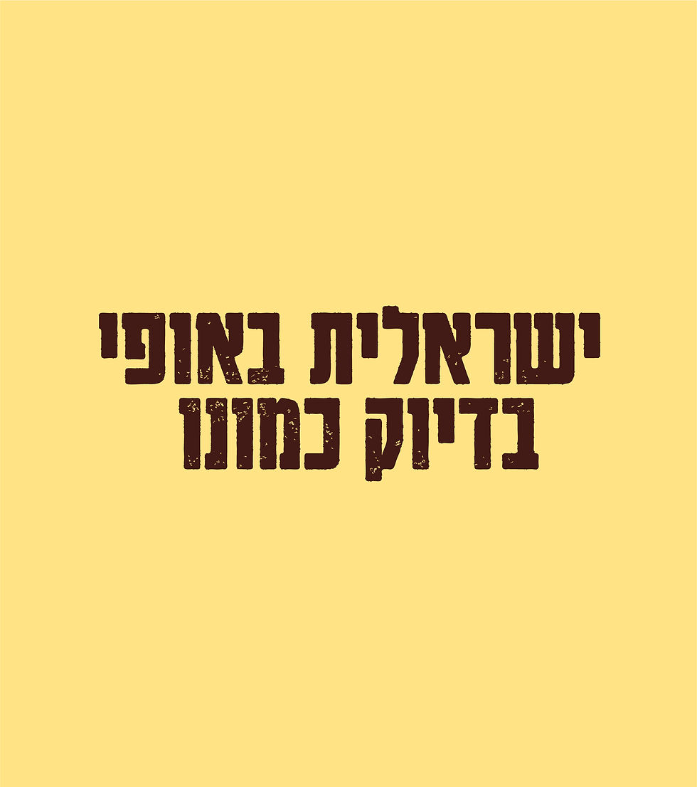
PERE Beer — Blonde, Lager, Dark. The client came to us with a clear idea: a bold, wild beer with real character.We created a visual identity that reflects that spirit — raw textures, sharp typography, and a design language inspired by the Wild West. Nothing polished, nothing safe.Just a strong, confident brand for a beer that leads, not follows.
SERVICES
Art Direction, Visual Identity, Social,
Logo, Mockups, Marketing,
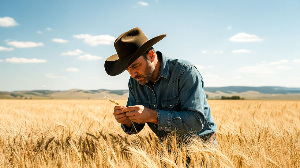
ORIGIN
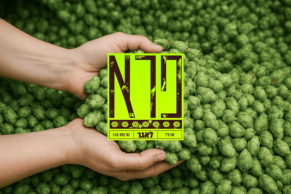
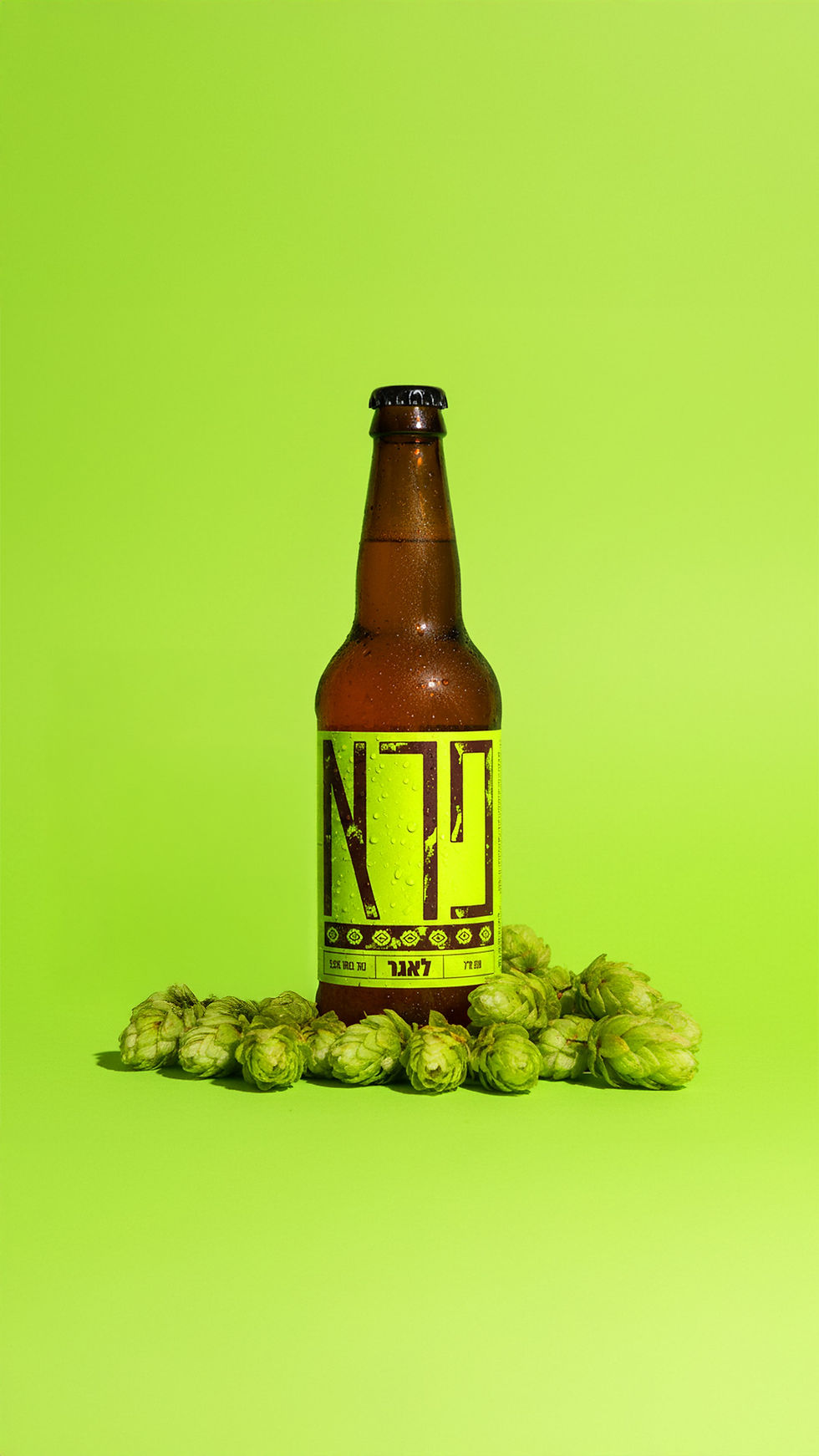
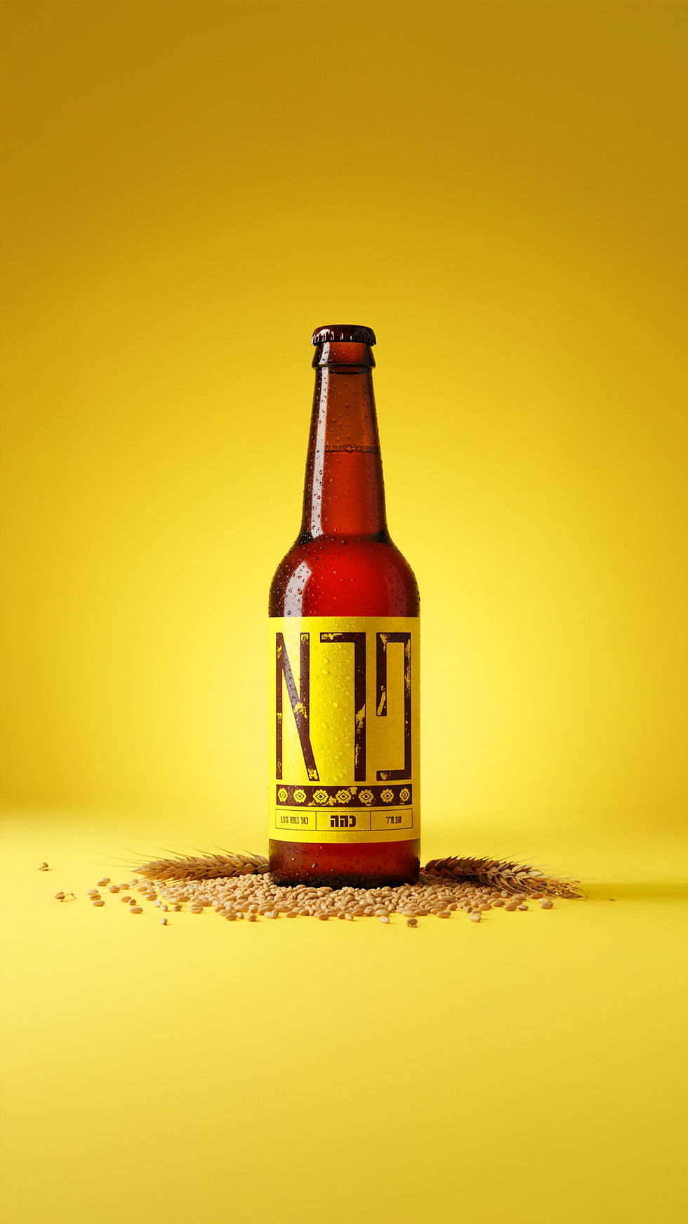
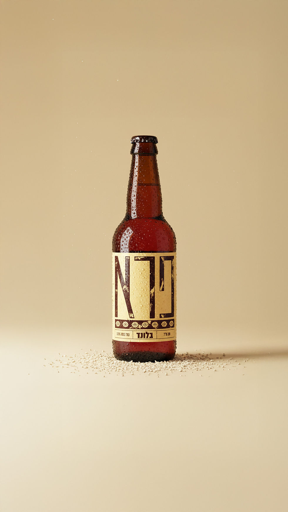
The story started with a clear idea: to create a beer brand that feels wild, bold, and free. We translated that into a visual world with colors that speak not only for each flavor — but for the very core of beer-making.
The color palette draws directly from its essential ingredients:
Blonde – #FFE384
Represents yeast — soft, vital, and at the heart of fermentation.
Lager – #C5FF0A
Reflects malt — warm, energetic, and full of character.
Dark – #94FF00
Symbolizes hops — bold, green, and unapologetically bitter.

_gif.gif)
ORIGIN
The story started with a clear idea: to create a beer brand that feels wild, bold, and free. We translated that into a visual world with colors that speak not only for each flavor — but for the very core of beer-making.
The color palette draws directly from its essential ingredients:
Blonde – #FFE384
Represents yeast — soft, vital, and at the heart of fermentation.
Lager – #C5FF0A
Reflects malt — warm, energetic, and full of character.
Dark – #94FF00
Symbolizes hops — bold, green, and unapologetically bitter.
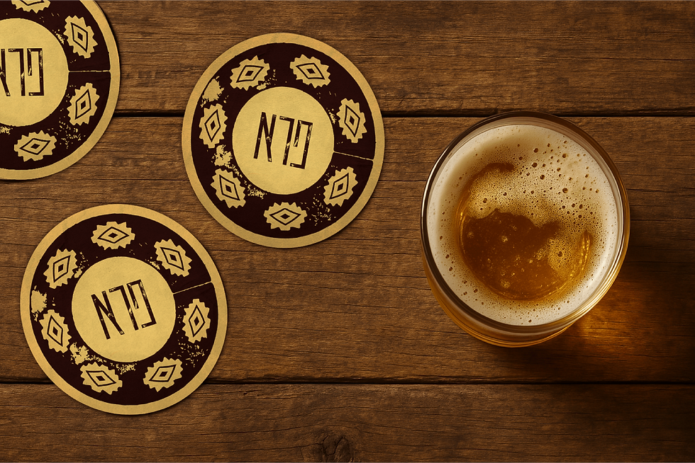
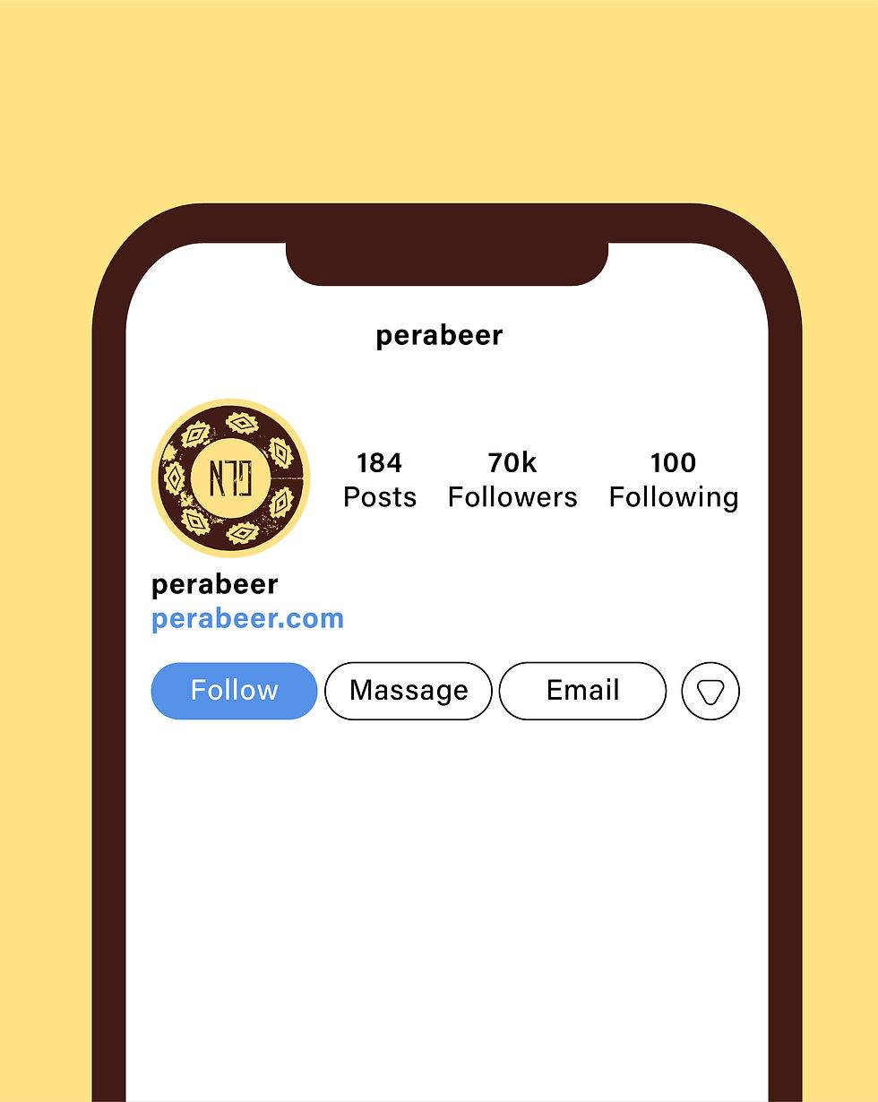
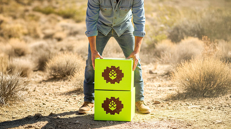
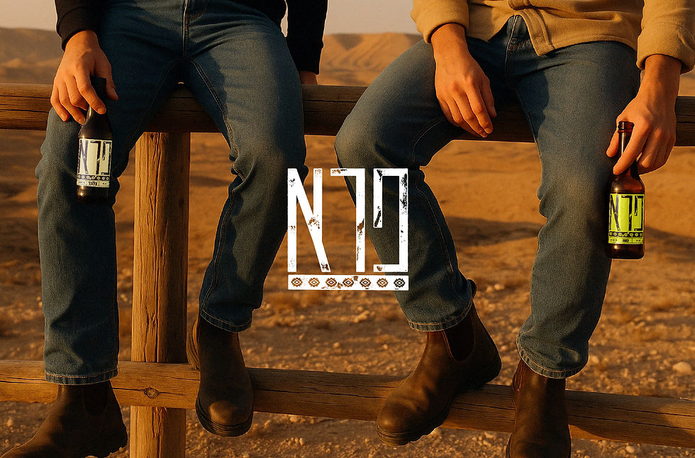
SOCIAL
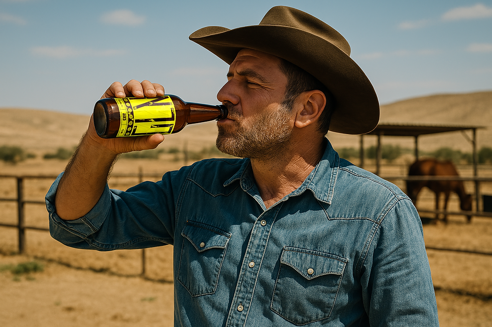
The PERA social presence was built to feel wild, free, and real just like the beer. Each visual places the product in its natural habitat: open landscapes, sun, and dust.
The desert backdrop highlights the bold label, making the bottle feel like it belongs. The cowboy aesthetics connect to the brand’s rugged spirit, while the festival energy brings people into the story — lively, sweaty, and unfiltered.
Every post shows that PERA isn’t just a beer, it’s a way of being: confident, untamed, and proudly different.